From Lyrachord to Code:
Modernizing an Icon


From Lyrachord to Code:
Modernizing an icon
PROJECT TOOLKIT:
Photoshop, Dreamweaver, Drupal, HTML, CSS, Javascript
HERO METRICS: RETENTION & BRAND LOYALTY
29.0% Average Bounce Rate | 81.3% Returning Visitor Rate | 5.31 Pages/Session | 3:30 Avg. Duration | +16.2% Session Volume
Focus: Cultivated industry-leading brand loyalty through specialized technical content, achieving superior retention rates and high-intent user journeys.
VISUAL OVERTURE
Final Pages
VISUAL OVERTURE
Final Pages
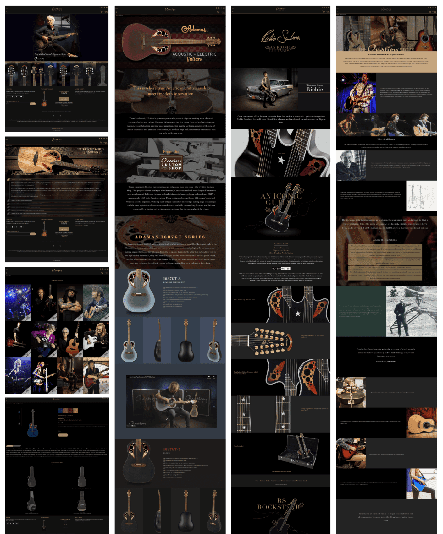
The final design defined the new digital stage, establishing the brand's premium, performance-focused identity and laying the foundation for the e-commerce functionality. The resulting look is clean, aspirational, and performance-focused, using high-impact imagery and the signature black-and-gold palette.
The final design defined the new digital stage, establishing the brand's premium, performance-focused identity and laying the foundation for the e-commerce functionality. The resulting look is clean, aspirational, and performance-focused, using high-impact imagery and the signature black-and-gold palette.
THE DIGITAL SOUNDCHECK: IDENTIFYING THE DISSONANCE
OVERVIEW
THE DIGITAL SOUNDCHECK: IDENTIFYING THE DISSONANCE
OVERVIEW
Brand: Ovation Guitars
Role: UX Designer and Web Developer
Collaboration with: VP of Global Marketing, Media Manager, Brand Manager
Brand: Ovation Guitars
Role: UX Designer and Web Developer
Collaboration with: VP of Global Marketing, Media Manager, Brand Manager
Every guitar player knows the iconic roundback and multi-port sound holes of an Ovation guitar. It's a brand synonymous with innovation and stage presence. However, as their existing website aged, it was beginning to feel more like a vintage relic than a cutting-edge instrument. The site was functional for viewing products, but it lacked the e-commerce functionality necessary for modern direct-to-consumer sales. Its visually generic, dated aesthetic failed to capture this legacy and diminished their reputation as a professional-grade instrument and engineering marvel.
Every guitar player knows the iconic roundback and multi-port sound holes of an Ovation guitar. It's a brand synonymous with innovation and stage presence. However, as their existing website aged, it was beginning to feel more like a vintage relic than a cutting-edge instrument. The site was functional for viewing products, but it lacked the e-commerce functionality necessary for modern direct-to-consumer sales. Its visually generic, dated aesthetic failed to capture this legacy and diminished their reputation as a professional-grade instrument and engineering marvel.
The Pain Points:
Brand Perception: Outdated visuals undermined the premium quality.
Product Discovery: A large, complex catalog was overwhelming and disorganized.
Friction: High click debt in the shopping journey due to poor hierarchy.
Our Goals:
Establish a high-end, aspirational black and gold identity.
Redesign the Information Architecture for massive scale and clarity.
Deliver a fully responsive and conversion-focused platform.
THE TECHNICAL ARRANGEMENT: STRUCTURING THE HARMONY
Information Architecture
THE TECHNICAL ARRANGEMENT: STRUCTURING THE HARMONY
Information Architecture
To solve the problem of overwhelming product variety, we moved away from a flat listing to a Tiered Product Hierarchy that promotes discovery while accommodating the large array of products. Over the course of the project, we tested several approaches. Our initial hypothesis was to prioritize browsing by Product Line but user feedback quickly indicated that enthusiasts preferred filtering by Instrument Type first (e.g., '6-String,' '12-String,' 'Bass'). This feedback loop led to the final tiered arrangement, which defines the logical flow and harmony of the user journey.
To solve the problem of overwhelming product variety, we moved away from a flat listing to a Tiered Product Hierarchy that promotes discovery while accommodating the large array of products. Over the course of the project, we tested several approaches. Our initial hypothesis was to prioritize browsing by Product Line but user feedback quickly indicated that enthusiasts preferred filtering by Instrument Type first (e.g., '6-String,' '12-String,' 'Bass'). This feedback loop led to the final tiered arrangement, which defines the logical flow and harmony of the user journey.
Primary List During Brainstorming
Primary List During Brainstorming
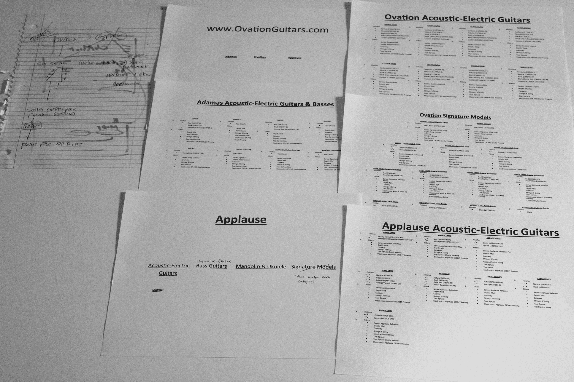
Initial Information Architecture
Initial Information Architecture

After User Feedback
After User Feedback

The Lines (Primary Entry)
The Lines (Primary Entry)
Description: Shop by Instrument Type (e.g., 6-String, 12-String, Bass).
UX Rationale: Directly reflects proven user preference for finding the functional model first, reducing friction.


The Refinement (Filtering)
The Refinement (Filtering)
Description: Refine selection by Soundholes and Depth
UX Rationale: Reduces cognitive load and high-friction filtering.
The Detail (Conversion)
The Detail (Conversion)
Description: Individual Product Pages for specs, imagery, and purchase.
UX Rationale: Clear pricing, prominent 'Add to Cart' (gold CTA).

THE ROAD TEST: PERFECTING THE PERFORMANCE
Style Guide
THE ROAD TEST: PERFECTING THE PERFORMANCE
Style Guide
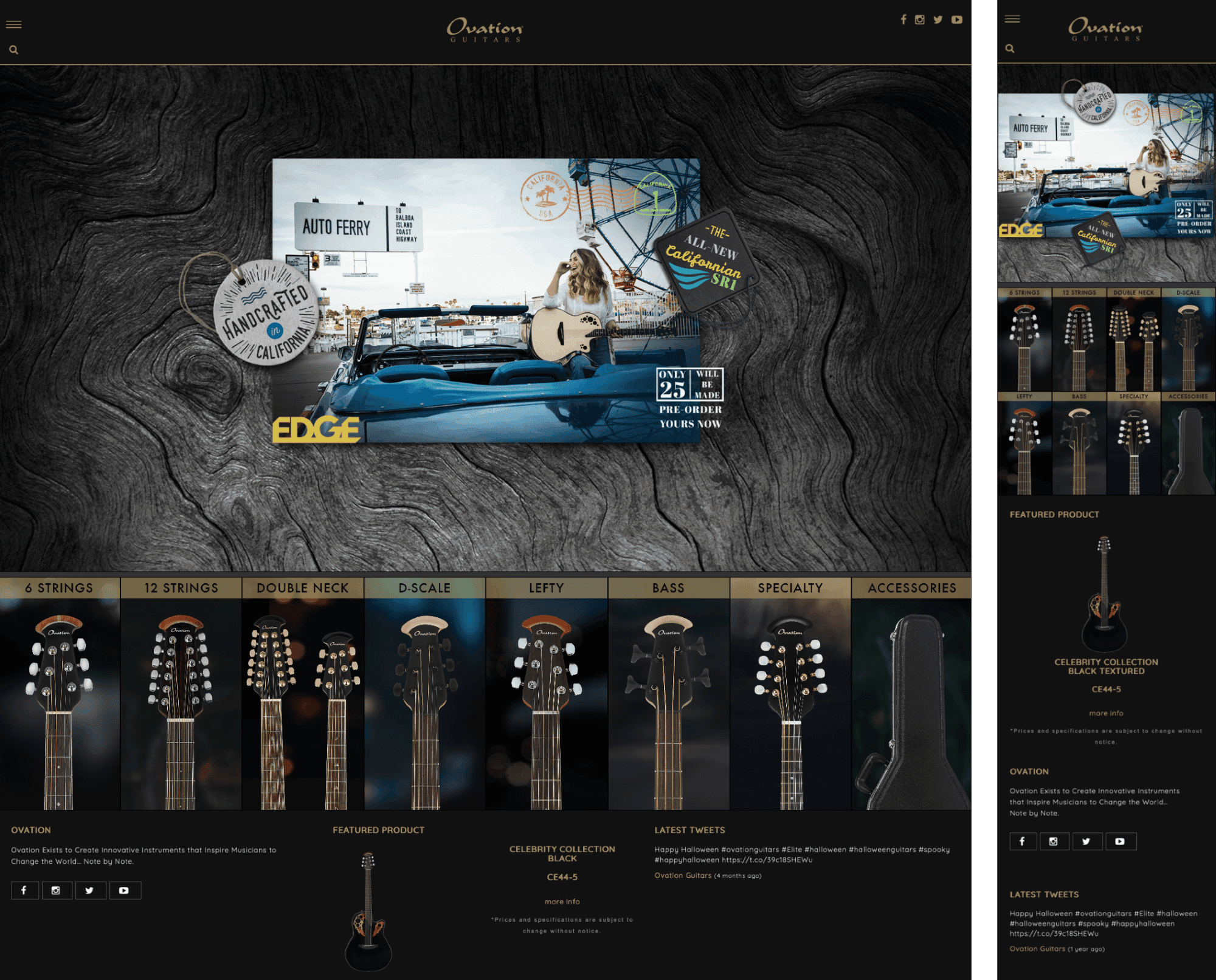
The shift to black and gold was a strategic pivot, designed to align the digital presence with the physical luxury of the instruments. We moved from generic "acoustic shop" to a premium, gallery-like experience. Black provided a dramatic canvas to make the guitar finishes stand out, while gold was used for accents and critical Call-to-Action (CTA) elements to guide the user's eye towards purchase. The font used for the new identity is Quicksand, reinforcing the modern, clean aesthetic.
The shift to black and gold was a strategic pivot, designed to align the digital presence with the physical luxury of the instruments. We moved from generic "acoustic shop" to a premium, gallery-like experience. Black provided a dramatic canvas to make the guitar finishes stand out, while gold was used for accents and critical Call-to-Action (CTA) elements to guide the user's eye towards purchase. The font used for the new identity is Quicksand, reinforcing the modern, clean aesthetic.

THE ROAD TEST: PERFECTING THE PERFORMANCE
Mockups
THE ROAD TEST: PERFECTING THE PERFORMANCE
Mockups
We focused on high-fidelity mockups for the three most critical interactions: the Home Page rhythm, the Product Detail experience, and the Sound Sampler immersion.
We focused on high-fidelity mockups for the three most critical interactions: the Home Page rhythm, the Product Detail experience, and the Sound Sampler immersion.
Home Page Layout
Home Page Layout
The responsive mock-ups focused on maximizing the use of the Hero Banner for promotional content while ensuring the core product lines were immediately accessible below the fold on all devices. Crucially, the primary navigation was distilled into a simple, mobile-style hamburger icon to maintain the clean, premium aesthetic. This "road test" focused on perfecting the technical execution of the design.
The responsive mock-ups focused on maximizing the use of the Hero Banner for promotional content while ensuring the core product lines were immediately accessible below the fold on all devices. Crucially, the primary navigation was distilled into a simple, mobile-style hamburger icon to maintain the clean, premium aesthetic. This "road test" focused on perfecting the technical execution of the design.
The Product Page
The Product Page
Ovation is defined by its revolutionary, non-traditional rounded Lyrachord bowl back. Traditionalists often view this synthetic material with skepticism, prioritizing the "old wood" aesthetic. Our Product Detail Page design had to overcome this hurdle by creating a digital trust experience focused on engineering and craftsmanship inspection.
Solution: We implemented a detailed product visualization system. Instead of a basic static image, the PDP featured a large, high-impact product image with a high-resolution zoom function to allow users to magnify the product and inspect the quality of the finish and materials firsthand. This was complemented by multiple product angles, comprehensive specification information, and recommended cases for easy accessorizing.
Result: This combination of deep inspection (zoom, multiple angles) and clear factual communication (specifications) making complex engineering claims digestible and immediately relevant to the visual feature, building confidence in the non-traditional de

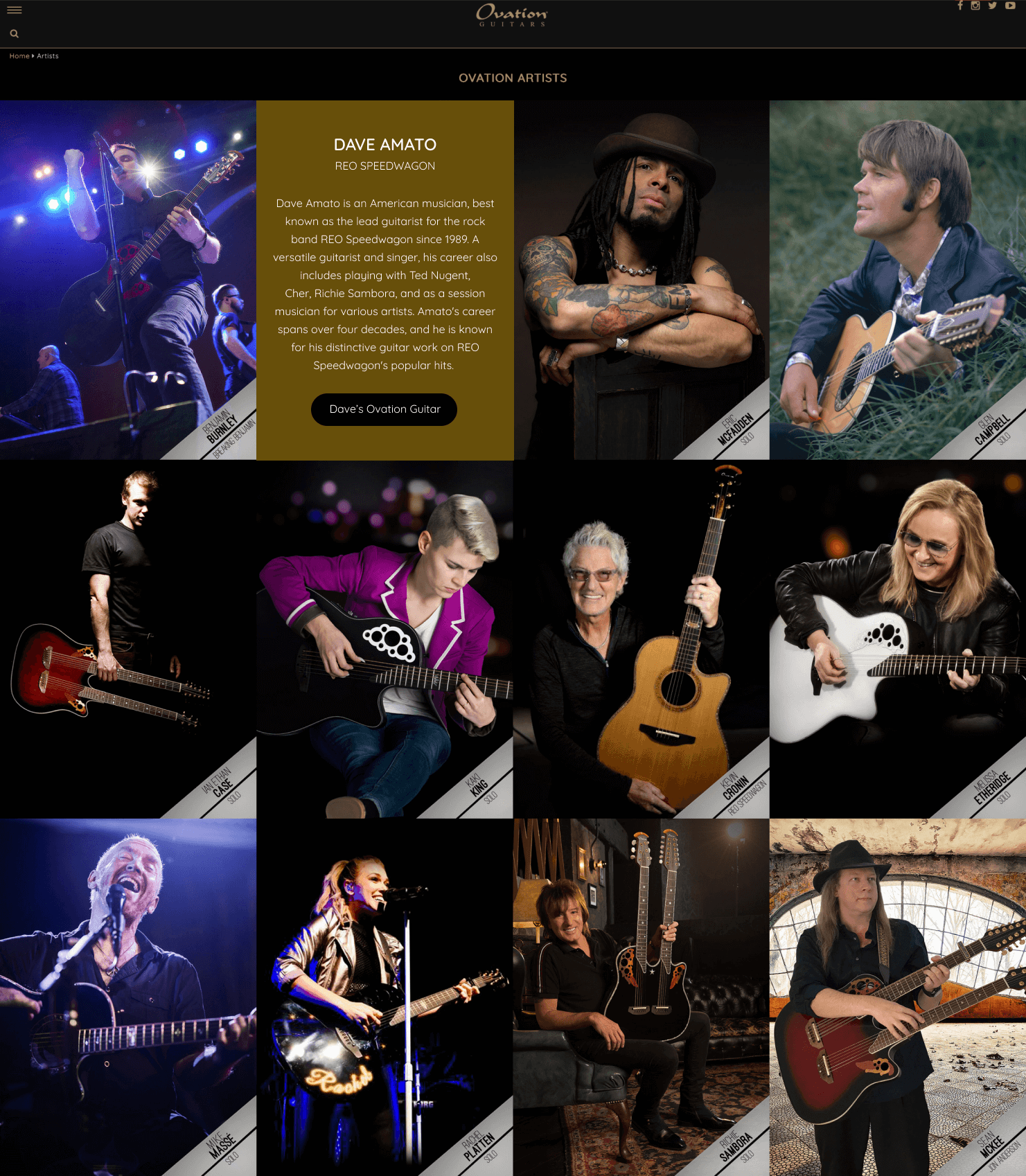
The Artist Page
Designed as a high-impact, scrollable grid of musician portraits, this section provided crucial social proof. The visual structure was minimal, allowing the photography of the artists and their instruments to dominate, with an interactive flip-on-hover function to reveal artist details, reinforcing the brand's authentic stage presence.
Masterwork Showcases
These pages serve as the ultimate trust builders. The Custom Shop page, in particular, was designed to emphasize American craftsmanship and the heritage of the New Hartford facility, assuring enthusiasts of the quality and pedigree behind the guitars.
Masterwork Showcases
These pages serve as the ultimate trust builders. The Custom Shop page, in particular, was designed to emphasize American craftsmanship and the heritage of the New Hartford facility, assuring enthusiasts of the quality and pedigree behind the guitars.

THE LEGACY TRACK: A FUTURE-PROOF EXIT
Conclusion
THE LEGACY TRACK: A FUTURE-PROOF EXIT
Conclusion
The new platform successfully modernized the brand and solved the critical discovery challenges. However, the ultimate validation came post-launch: the company decided to sell the brand.
Because the architecture was clean, the assets were well-organized, and the codebase was developed from scratch to finish focusing on best practices, the transfer of assets to the new ownership was seamless. The project proved that excellent UX and meticulous development result in a high-value, future-proof digital asset.
Project Success Metrics:
Successful Brand Relaunch.
Intuitive Navigation for Large Product Array.
100% Seamless Asset Transfer During Acquisition.
© 2026 All Rights Reserved.
All work for hire projects belong to their respective companies.
© 2026 All Rights Reserved.
All work for hire projects belong to their respective companies.
© 2026 All Rights Reserved.
All work for hire projects belong to their respective companies.