Center Stage:
Streaming Reimagined for Mobile


Center Stage
Streaming Reimagined for Mobile
PROJECT TOOLKIT:
Figma, Photoshop, Google Analytics, Google Forms, Google Slides
PROJECT TOOLKIT:
Figma, Photoshop, Google Analytics, Google Forms, Google Slides
THE BEST SEAT: CRAFTED FOR THE MOBILE USER
THE BEST SEAT: CRAFTED FOR THE MOBILE USER
In the fast-paced world of mobile-first consumption, a jarring reality exists: most video players are not designed for the small screen, they are simply shrunk to fit. Users are often relegated to a digital "back row," squinting at tiny text and constantly scrolling away from the content just to interact. Our project, Streaming, Reimagined, was born to fundamentally change this, giving every viewer a personalized, uninterrupted center stage experience, right in the palm of their hand.
In the fast-paced world of mobile-first consumption, a jarring reality exists: most video players are not designed for the small screen, they are simply shrunk to fit. Users are often relegated to a digital "back row," squinting at tiny text and constantly scrolling away from the content just to interact. Our project, Streaming, Reimagined, was born to fundamentally change this, giving every viewer a personalized, uninterrupted center stage experience, right in the palm of their hand.
THE CENTER STAGE BLUEPRINT
Deliverables
THE CENTER STAGE BLUEPRINT
Deliverables
This section showcases the three critical deliverables that brought our vision of a unified, controlled, and adaptive mobile streaming experience to life.
This section showcases the three critical deliverables that brought our vision of a unified, controlled, and adaptive mobile streaming experience to life.
The Director's Cut: Instant Camera Control
We successfully transitioned camera switching from a hidden feature to a core interaction. The prototype showcases the instantaneous, zero-latency transition between feeds. This seamless function, guided by prevalent icons and clear text labels (with hover/active states), puts the user in the "director's seat."
The design ensures that viewers can intuitively take control of their perspective without ever disrupting the flow of the stream, directly addressing the discoverability issue identified in user feedback.


The Unified Hub: Watch and Interact Simultaneously
By adopting the fixed-video, scrollable-tabs architecture, we created the Unified Hub. This single interface allows viewers to fluidly switch between:
Live Chat: Engaging with the community instantly.
Merchandise: Browsing and purchasing without losing video context.
Info/Chapter Marks: Quickly navigating the content timeline and viewing supplementary data.
The prototype demonstrates how the tabbed system efficiently utilizes the small screen dimensions to eliminate the painful fragmentation dilemma and enhance engagement.
The prototype demonstrates how the tabbed system efficiently utilizes the small screen dimensions to eliminate the painful fragmentation dilemma and enhance engagement.
Rock Solid: Consistency in Every Orientation
A truly mobile-first design must be adaptable. This deliverable proves the solution works identically and intuitively across both portrait and landscape modes. While portrait uses the top/bottom split, rotating to landscape transforms the interface into a lateral split-screen view: the fixed video remains on the left, and the scrollable tabs and interactive content occupy the right side. This ensures that whether the user maximizes viewing space or keeps the phone upright for easy chat access, the core UX remains constant. The elements scale responsively, and controls maintain logical placement, ensuring the user never has to re-learn the interface.

THE ROADBLOCK: USER FRICTION POINTS
Challenge
THE ROADBLOCK: USER FRICTION POINTS
Challenge
Based on our initial research findings and user feedback, two primary pain points were significantly hindering a seamless viewing experience:
Based on our initial research findings and user feedback, two primary pain points were significantly hindering a seamless viewing experience:
The Fragmentation Dilemma
Users wanted a rich, interactive experience, but engaging in live chat, or browsing merchandise meant exiting the video view or endlessly scrolling down a page. This content-switching was disruptive and led to high drop-off rates when interactive features were desired.
The Fragmentation Dilemma
Users wanted a rich, interactive experience, but engaging in live chat, or browsing merchandise meant exiting the video view or endlessly scrolling down a page. This content-switching was disruptive and led to high drop-off rates when interactive features were desired.
USER COMMENT
"Would be nice if chat stream were available while watching. If you are typing in the chat, you lose half the viewing screen."
The Invisible Feature Problem
Our system contained a highly valuable capability: the seamless ability to switch between multiple camera angles but user research confirmed viewers were simply unaware it existed. The feature lacked the necessary affordance; a critical value proposition was rendered inert because users could not find or use it.
USER COMMENT
"I did not know the multi-cam feature existed."
THE METHOD: OUR DATA-DRIVEN PROCESS
Research
THE METHOD: OUR DATA-DRIVEN PROCESS
Research
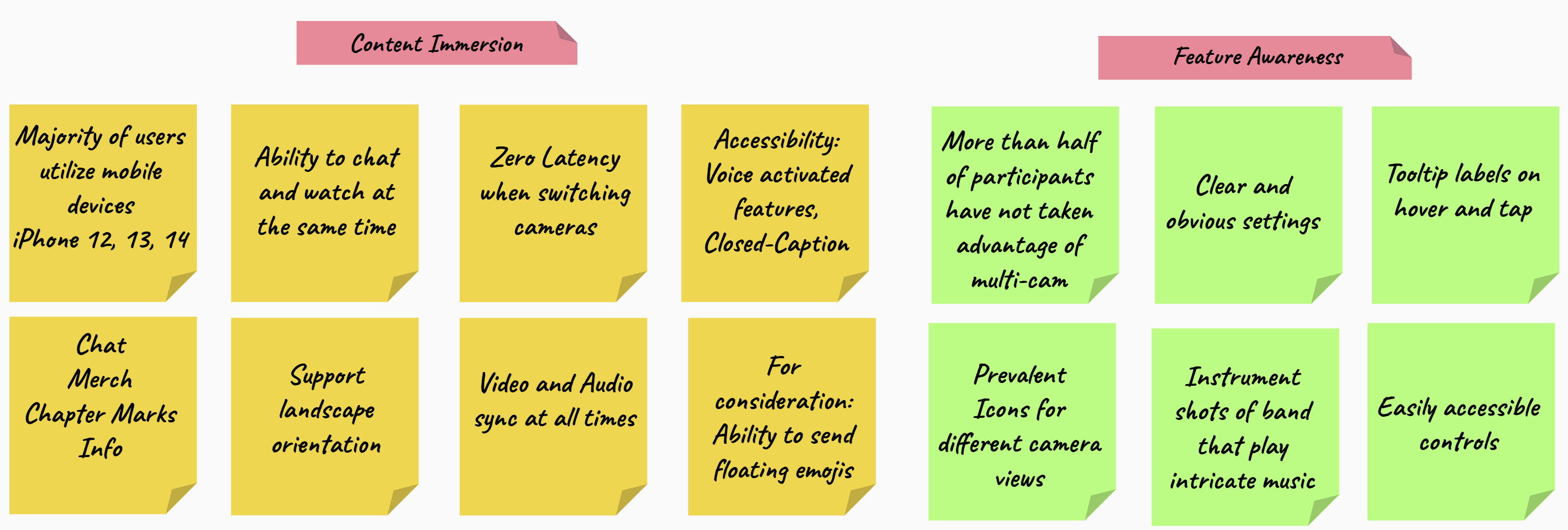
We anchored our design cycle in the Design Thinking Methodology, moving deliberately from empathy through prototyping, testing, and iteration. Our mobile-first mandate was driven by data showing heavy usage on modern iPhone devices (specifically the iPhone 14, 13 and 12).
We anchored our design cycle in the Design Thinking Methodology, moving deliberately from empathy through prototyping, testing, and iteration. Our mobile-first mandate was driven by data showing heavy usage on modern iPhone devices (specifically the iPhone 14, 13 and 12).
Phase 1: Empathy, Analysis and Define
We initiated the process by employing Google Analytics to gather crucial quantitative data on device usage and drop-off points. This was supplemented by an ongoing User Research Survey to obtain rich qualitative insights into user frustrations and desires. This combined data provided the foundation necessary to Define two core design requirements:
Maintain Content Immersion: The video must never be hidden or obstructed during interaction.
Maximize Feature Awareness: Key functionality, like camera switching, must be immediately recognizable and accessible.
Phase 2: Ideation
Moving from research to execution, we began visualizing the solution, ensuring every design choice addressed our two core requirements, Immersion and Awareness).
Phase 2: Ideation
Moving from research to execution, we began visualizing the solution, ensuring every design choice addressed our two core requirements, Immersion and Awareness).
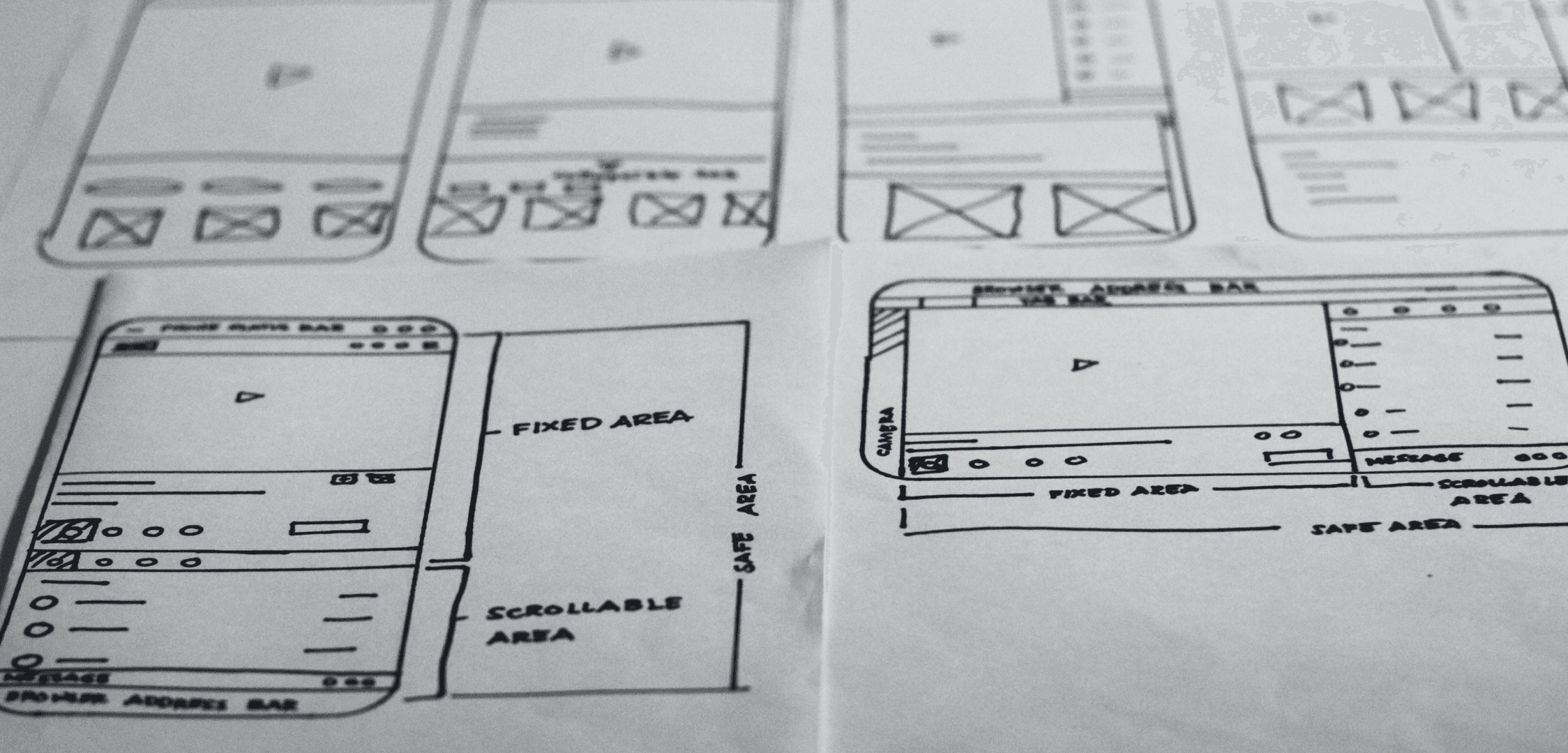
Sketching the Unified Frame
Before moving to high-fidelity mock-ups, I engaged in rapid paper wireframing to quickly translate our core requirements into a tangible structure. This low-fidelity step was crucial for solving the spatial puzzle of the mobile screen. I sketched multiple iterations for both portrait and landscape orientations to test the precise placement of the fixed video section and the scrollable tab modules.
This process confirmed that the split-screen architecture was the most efficient way to achieve both content immersion and feature access within the tight constraints of the iPhone viewport.
THE BREAKTHROUGH: DESIGNING UNITY
Solution
THE BREAKTHROUGH: DESIGNING UNITY
Solution
The solution required a fundamental spatial reorganization of the mobile interface, transforming the vertical screen into a dynamic, two-part viewing hub that delivered both seamless immersion and total user control.
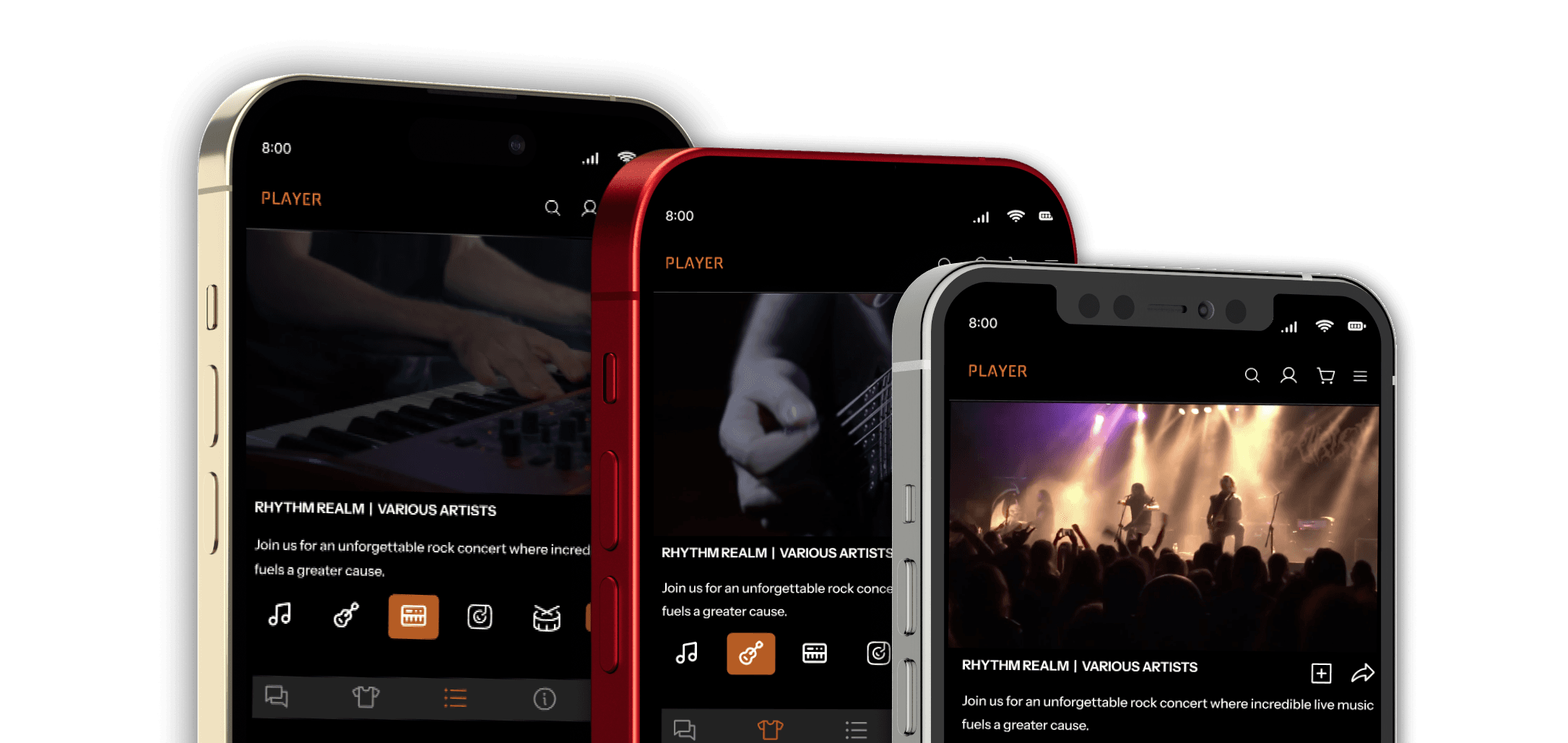
PROTOTYPE FOCUS
The validated solution was realized as a high-fidelity prototype, demonstrating final interactions and visual polish. All design iterations were rigorously validated against the precise usage patterns and dimensions of the iPhone 14, 13, and 12 series, ensuring the Unified Frame is optimized for the devices where our audience spends the most time.
The solution required a fundamental spatial reorganization of the mobile interface, transforming the vertical screen into a dynamic, two-part viewing hub that delivered both seamless immersion and total user control.
PROTOTYPE FOCUS
The validated solution was realized as a high-fidelity prototype, demonstrating final interactions and visual polish. All design iterations were rigorously validated against the precise usage patterns and dimensions of the iPhone 14, 13, and 12 series, ensuring the Unified Frame is optimized for the devices where our audience spends the most time.
IMMERSION AND CONTROL: THE SPLIT-SCREEN STRATEGY
We implemented a split-screen architecture to eradicate content-switching. The Fixed Top Section locks the video player in view, the source of "center stage" immersion. The Scrollable Bottom Section consolidates all interactive elements (Chat, Merch, Chapter Marks) into an efficient tabbed navigation system.
Simultaneously, we solved the invisibility problem by replacing hidden cues with prevalent icons and helpful text labels, making complex features like camera switching immediately obvious and accessible.

BUILDING FOR ALL
Foundational Accessibility
BUILDING FOR ALL
Foundational Accessibility

Our commitment to inclusivity means the Center Stage experience is universal. We integrated robust, customizable Closed Captioning (CC) controls and native Voice Functions. These features provide comprehensive accessibility, empowering users including those with mobility or hearing impairments, to manage critical functions like playback and tab switching seamlessly.
Our commitment to inclusivity means the Center Stage experience is universal. We integrated robust, customizable Closed Captioning (CC) controls and native Voice Functions. These features provide comprehensive accessibility, empowering users including those with mobility or hearing impairments, to manage critical functions like playback and tab switching seamlessly.
WHAT'S NEXT: HANDHELD TO HORIZON
WHAT'S NEXT: HANDHELD TO HORIZON
The Streaming, Reimagined project successfully shifts the mobile experience from a back-row distraction to a personalized, center stage viewing hub. We have laid a robust foundation built on user empathy and data-driven decisions, proving that powerful features and rich interaction can coexist gracefully on the smallest screen.
As an ongoing project, the next phase focuses on continuous refinement. This involves conducting ongoing user research and user testing to inform necessary iteration based on evolving user and platform needs.
Following this validation loop, we will apply progressive enhancement to scale this proven mobile UX to larger screens, ensuring a consistent and high-quality experience that maintains the center stage immersion regardless of device.
© 2026 All Rights Reserved.
All work for hire projects belong to their respective companies.
© 2026 All Rights Reserved.
All work for hire projects belong to their respective companies.
© 2026 All Rights Reserved.
All work for hire projects belong to their respective companies.