Sunset Serenade:
The Design of Stripped Out West
Sunset Seranade:
The Design of
Stripped Out West

Sunset Serenade:
The Design of Stripped Out West
PROJECT TOOLKIT:
Illustrator, Photoshop, After Effects, Figma, GetResponse, Klaviyo
PROJECT TOOLKIT:
Illustrator, Photoshop, After Effects, Figma, GetResponse, Klaviyo
FROM THE DUST ROAD TO THE DIGITAL STAGE
FROM THE DUST ROAD TO THE DIGITAL STAGE
THE FIRST CHORD: THE CHALLENGE
The acoustic guitar's every note demanded a visual echo. Our mission went beyond simple design; it was a pure Sound to Sight Translation. The challenge was to translate the unfiltered emotional depth of the Stripped Out West performance into a stark, singular visual identity. This brand had to embody the soulful vulnerability of the acoustic setting, all while boldly symbolizing the artist bringing the essence of country music to a Western stage.
Our challenge was simple, but the journey was complex. How do you bottle the heartfelt, acoustic twang of a guitar, the ruggedness of a dusty road, and the inviting glow of a neon sign all into one unforgettable visual identity?
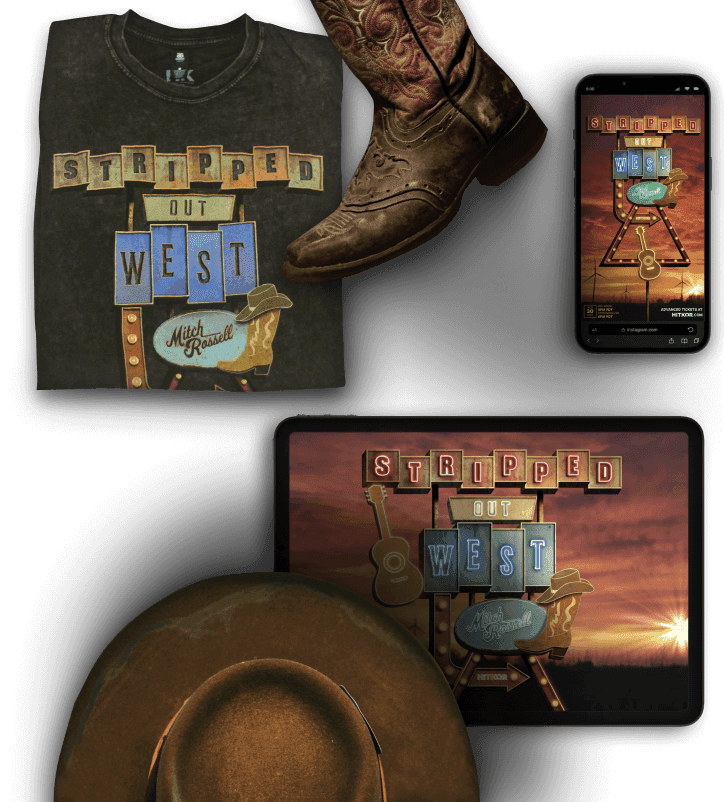
VERSE 1: THE SHOWSTOPPER
Deliverables
VERSE 1: THE SHOWSTOPPER
Deliverables
TAKING THE SHOW ON TOUR
The visual identity for Stripped Out West was born to perform. Its true power lay in its versatility, adapting flawlessly across a wide range of media to ensure a consistent and compelling experience. We knew this brand wasn't just for a single stage; it had to live on every screen, every shirt, and every poster. From the beginning, I designed the art to be infinitely scalable, so its high-resolution foundation could be adapted for any platform without losing a pixel of quality.
Video Assets
I transformed the static artwork into a dynamic brand experience. The core visual identity was brought to life through motion graphics, creating a high-resolution, animated scene. The final result featured the neon signage flickering to life, the windmills turning and the sun's rays gleaming as if the design was truly a living, breathing landscape. This core video asset was a central piece of the brand, a visual song that was then adapted for multiple uses:
Video Walls
The high-resolution art was scaled for massive screens at the live event, creating a dramatic backdrop for the performance.
Video Walls
The high-resolution art was scaled for massive screens at the live event, creating a dramatic backdrop for the performance.

Video Bumpers
The short atmospheric sequences featuring subtle, key motion elements were used as intros and outros for digital content.
Video Bumpers
The short atmospheric sequences featuring subtle, key motion elements were used as intros and outros for digital content.
Video Bumpers
The short atmospheric sequences featuring subtle, key motion elements were used as intros and outros for digital content.
Social Media
I created shorter, optimized clips from the motion graphics for posts and stories that captured attention and generated hype.
Social Media
I created shorter, optimized clips from the motion graphics for posts and stories that captured attention and generated hype.
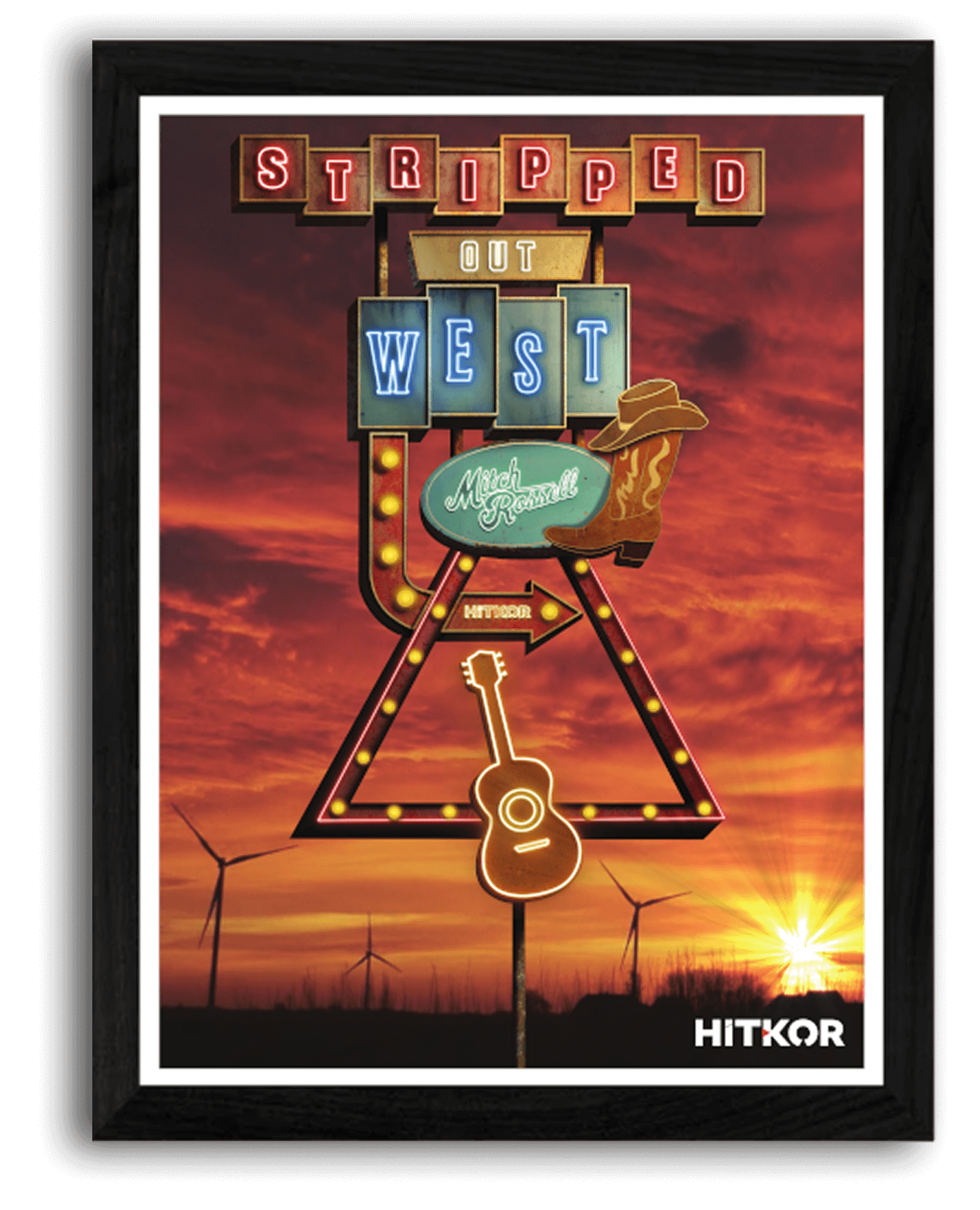
Print & Posters
The high-resolution design translated beautifully to a classic printed poster, perfect for venue signage.
Print & Posters
The high-resolution design translated beautifully to a classic printed poster, perfect for venue signage.
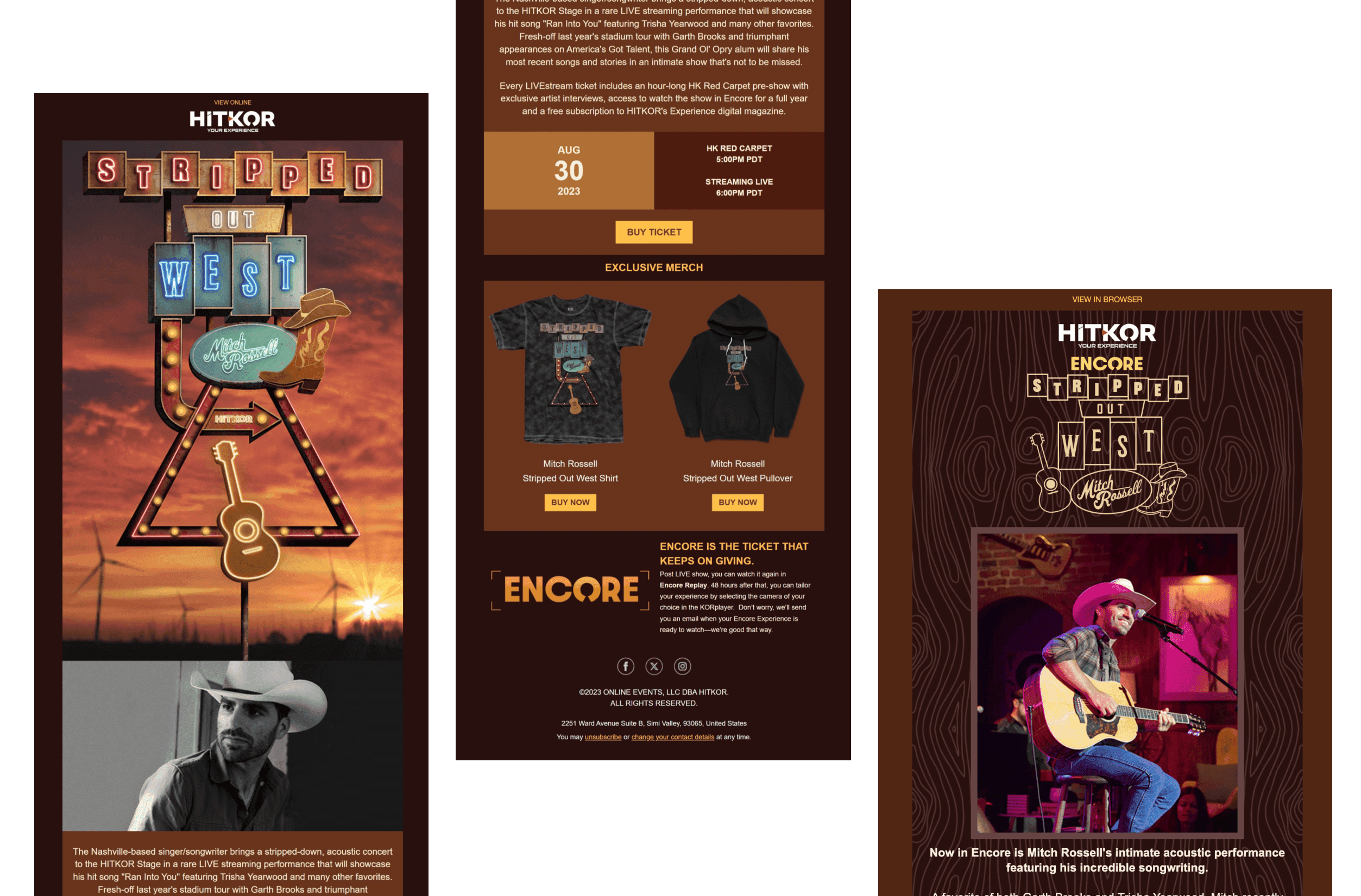
Newsletters
The detailed artwork was utilized to create immersive email campaigns, seamlessly bringing the brand's visual identity directly to the audience's inbox.
Newsletters
The detailed artwork was utilized to create immersive email campaigns, seamlessly bringing the brand's visual identity directly to the audience's inbox.
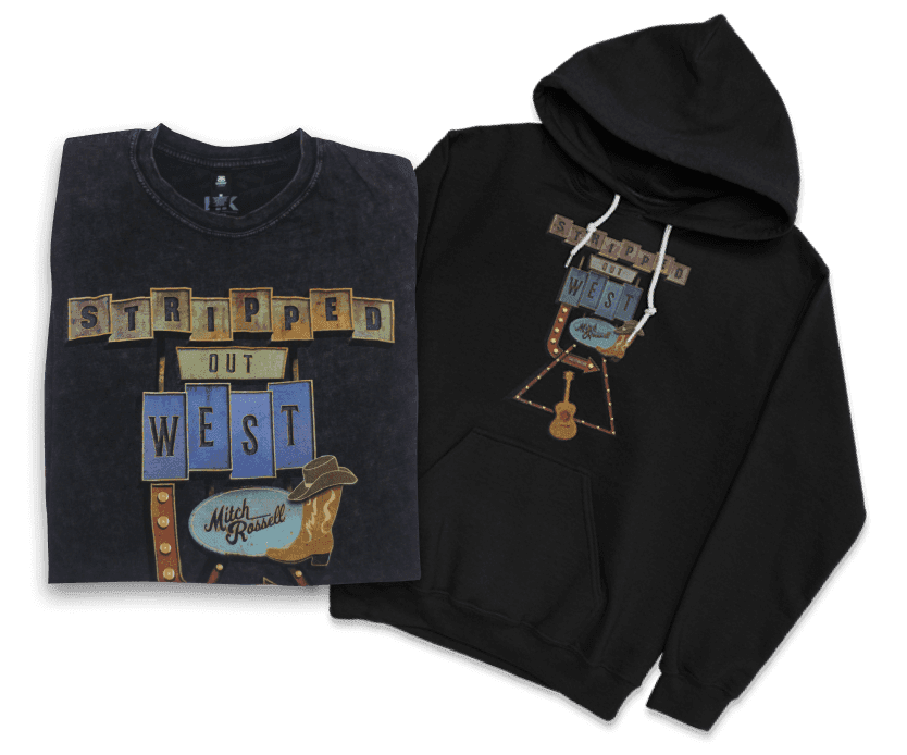
Merchandise
A simplified version of the artwork was used on shirts and hoodies allowing fans to take a piece of the experience home.
Merchandise
A simplified version of the artwork was used on shirts and hoodies allowing fans to take a piece of the experience home.
Merchandise
A simplified version of the artwork was used on shirts and hoodies allowing fans to take a piece of the experience home.
VERSE 2: THE SOUL SEARCH
Research
VERSE 2: THE SOUL SEARCH
Research
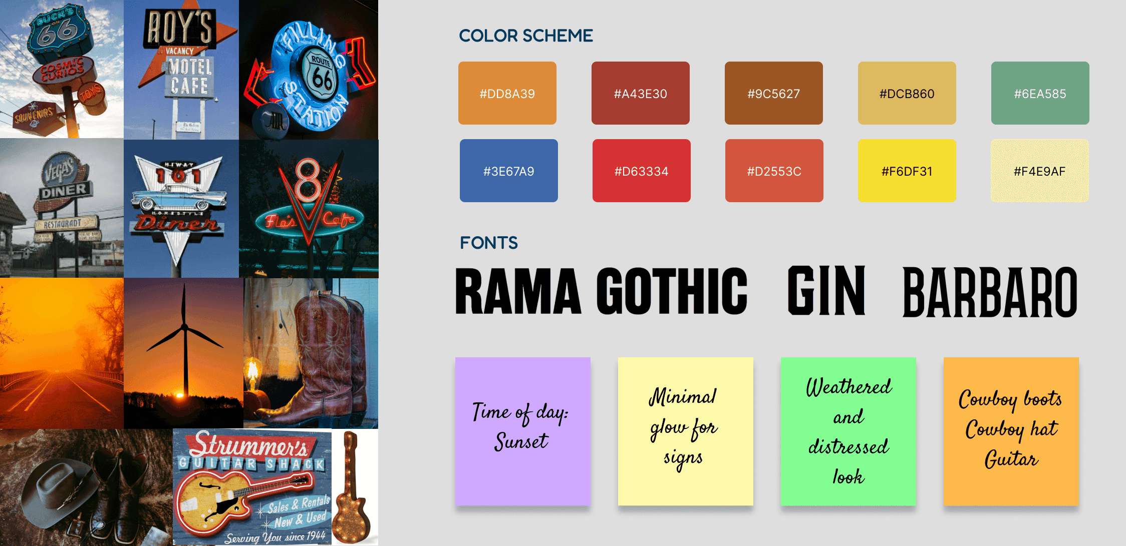
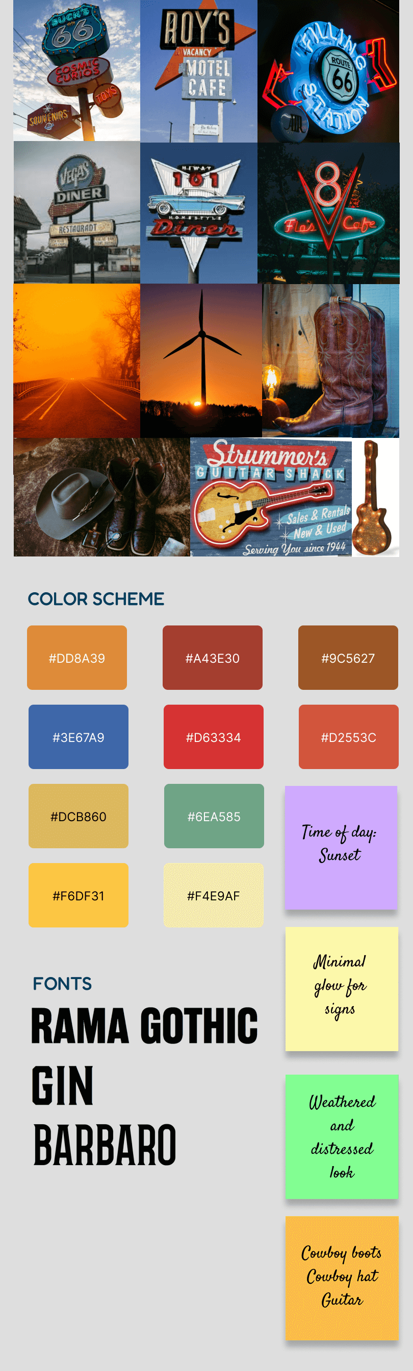
FINDING THE VIBE ON THE DUSTY TRAIL
Before a single line was drawn, I dove headfirst into the rich history of country music and Americana. My research was a journey through time, exploring:
FINDING THE VIBE ON THE DUSTY TRAIL
Before a single line was drawn, I dove headfirst into the rich history of country music and Americana. My research was a journey through time, exploring:
Vintage Signage: Studying the aesthetic of classic diners, motels, roadhouses and vintage gas stations, I was drawn to the stylized shapes and bold typography that told a story before you even walked through the door.
Painter's Palette: I analyzed the intense colors of a Western sunset—the fiery reds, deep oranges, and golden hues of the clouds, creating a dramatic backdrop for the bright, electrified pops of neon that cut through the dusk.
The Storytelling Elements: The guitar, the cowboy hat, the boots—these aren't just objects; they are characters in the grand story of country music. My goal was to make them feel like a natural part of the narrative.
VERSE 3: THE ART OF STRUM
Concepts
VERSE 3: THE ART OF STRUM
Concepts
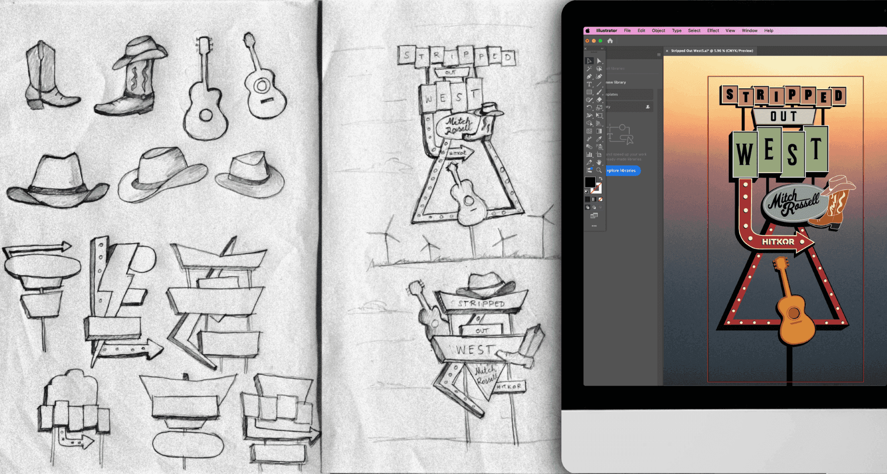
FROM PENCIL SKETCHES TO VECTORIZED DREAMS
With a clear vision in mind, I began the process with rough sketches on paper. I explored different compositions and experimented with various layouts, trying to fit a neon sign motif into a classic marquee shape. The magic was in the details: finding the perfect balance between the iconic cowboy hat, boots and the flowing neck of a guitar.
Once I landed on a layout that felt right, I took the design into Adobe Illustrator. This is where the idea was truly "stripped out." I converted my rough sketches into clean, precise vector art. This clean vector file served as the essential, infinitely scalable foundation for all final deliverables, ensuring perfect quality across the entire spectrum of media, from a massive video wall down to the smallest social media graphic.

VERSE 4: FROM GRIT TO GLOW
Composite
VERSE 4: FROM GRIT TO GLOW
Composite
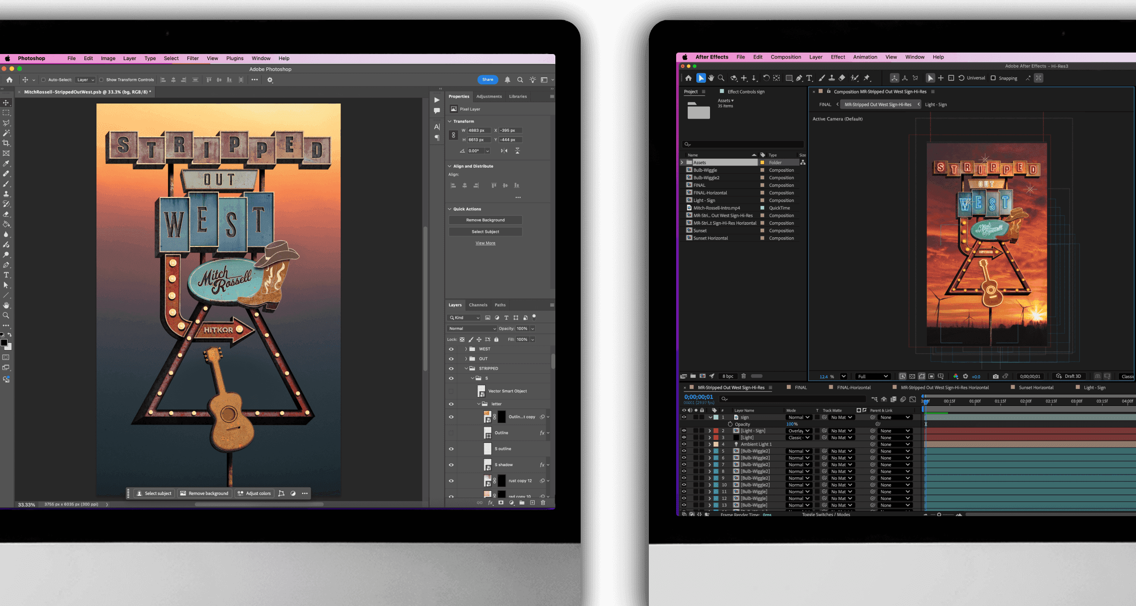
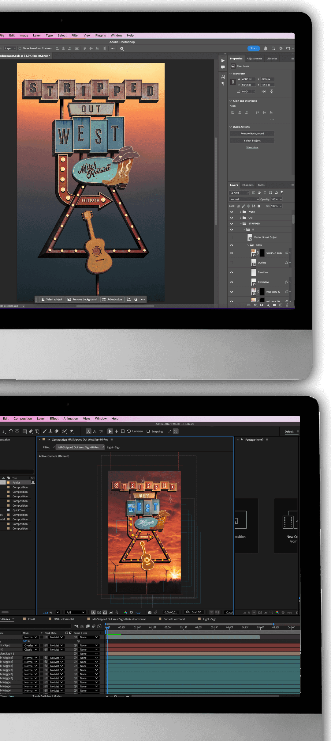
RUST AND RADIANCE
A clean vector file is beautiful, but it lacks soul. The visual identity for Stripped Out West needed to feel like it had a history, a story that felt as worn-in as an old pair of cowboy boots.
Static Texturing (Photoshop)
I first brought the vector art into Adobe Photoshop to apply the finishing touches that would give it authentic, static character. This included:
Subtle Textures: A fine grain to simulate the wear and tear of a vintage sign.
Aged Details: Faded spots, simulated rust, and worn edges to give the brand a sense of history.
Dynamic Motion (After Effects)
Once the static design had its authentic grit, the asset was exported and brought into Adobe After Effects for the final motion sequence. This is where the magic of the performance came to life:
Animated Background: The sunset background and windmills were added and given realistic, subtle movement to establish the atmosphere of a dusty, sunset scene.
Flickering Neon: Realistic lighting was added to the neon sign elements, complete with flickering effects and subtle light blooms to simulate a buzzing, old roadhouse sign coming to life at dusk.
Dynamic Lighting and Shadows: Realistic lighting and dynamic shadows were implemented to give the entire scene a dramatic, three-dimensional presence on the stage screen.
This combined process transformed a simple design into a living, breathing piece of art that felt like it had been waiting for us at the end of a long, dusty road.
VERSE 5: THE CODA
Conclusion
VERSE 5: THE CODA
Conclusion
Sunset Serenade wasn't just a design project; it was an exercise in storytelling. We didn't just create an artwork, we crafted a narrative that connected country music's timeless heart with the vast, dramatic landscape of the American West.
This project solidified my belief in the power of a cohesive, emotionally resonant visual identity, and the importance of a well-defined process to bring a complex vision to life.
I hope you enjoyed the journey as much as I did.
Thanks for stopping by!
© 2026 All Rights Reserved.
All work for hire projects belong to their respective companies.
© 2026 All Rights Reserved.
All work for hire projects belong to their respective companies.
© 2026 All Rights Reserved.
All work for hire projects belong to their respective companies.